Navigate around a service
note
This pattern is intended for staff-facing use only.
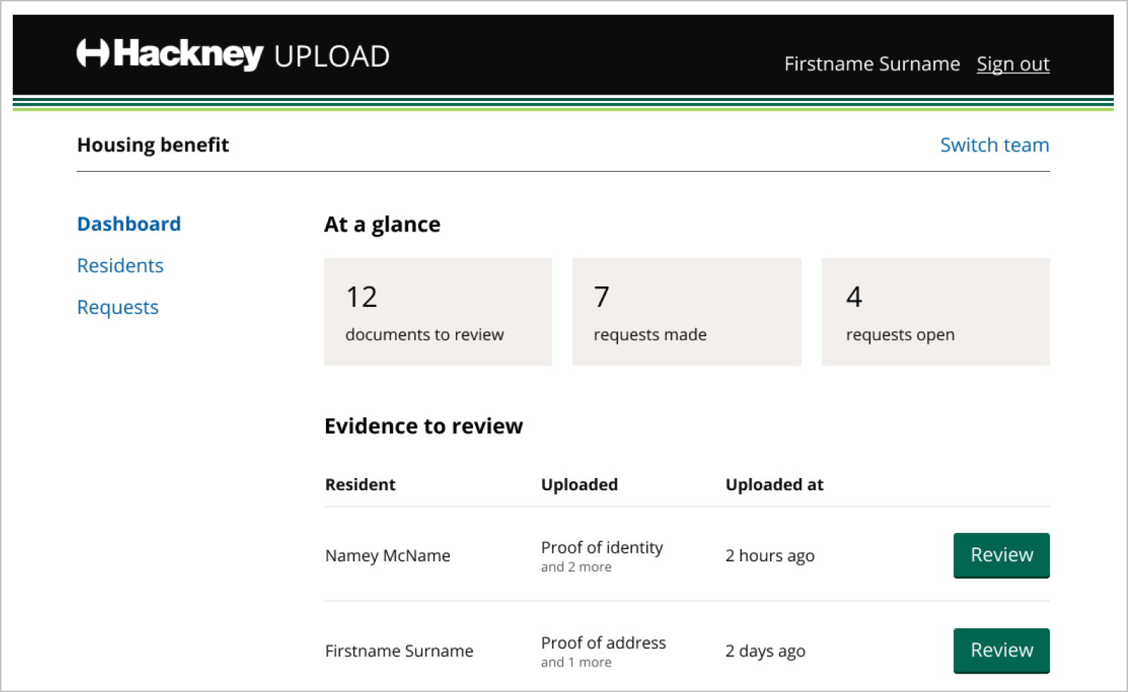
There is no single perfect pattern for the main navigation of a service, but this pattern is a good place to start:

The content in staff-facing tools generally changes too quickly to make adding a visited state to links useful. You can use the lbh-link--no-visited-state class to keep navigation links their default unvisited colour.
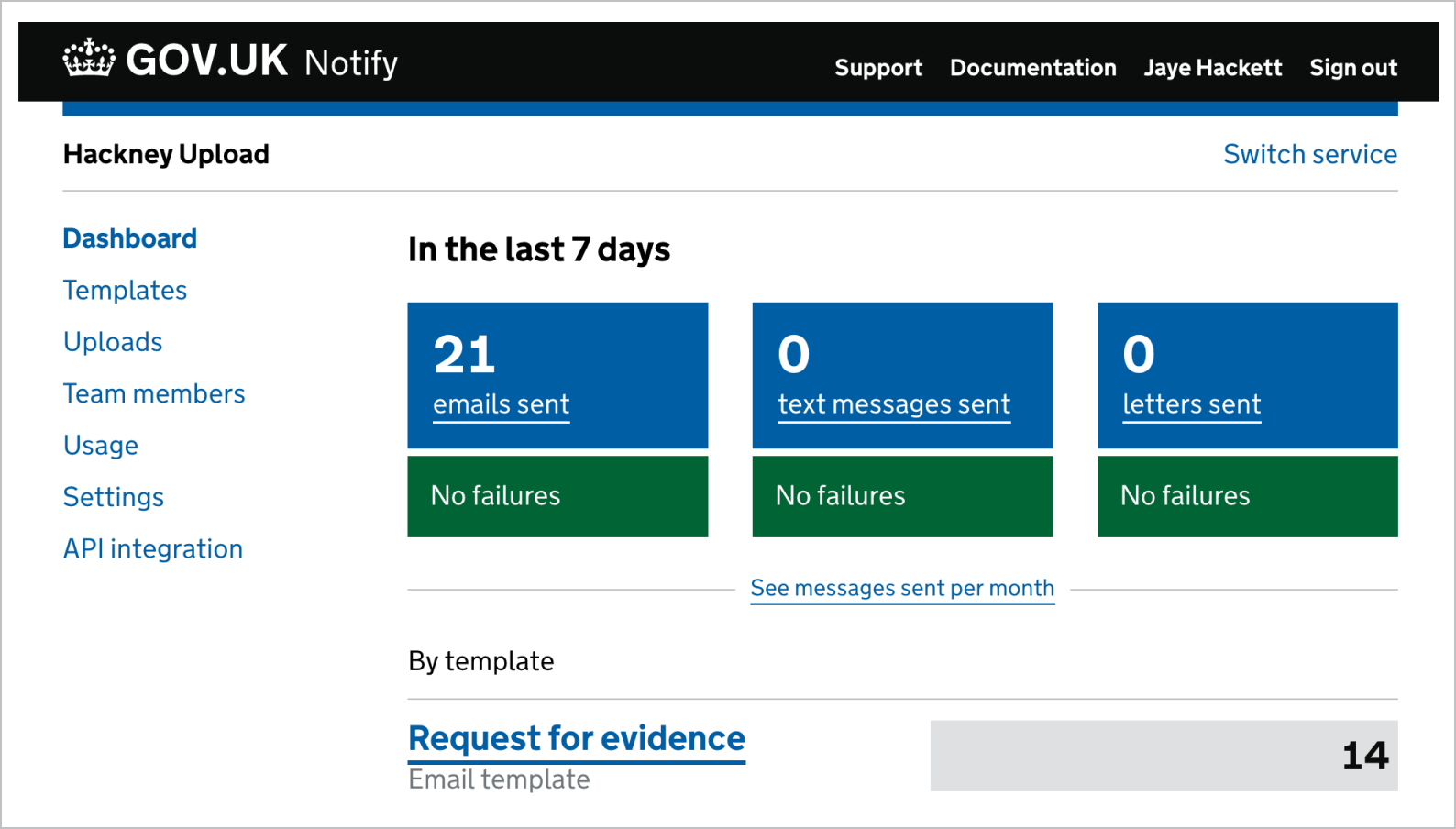
This pattern is used by tools like the GOV.UK Notify dashboard:

If you need to show very wide content, such as a table with many columns, you could consider putting your main navigation across the top of the interface instead.